
SITARA | BRAND IDENTITY
Lestrange is a Paris-based jewellery design company with deep roots. It's a gold and precious stone jeweler company with a Parisian background and craft. It intends to enter India through a partnership with Tanishq and the creation of an uber premium brand. It has a 120-year history.
It enjoys the support of France and Italy. It intends to expand into new markets and grow financially. Collections will be launched across borders. The brand is aimed at those with a high income and who are between the ages of 20 and 60. It honors cross-border crafts that are infused with the best materials and design. Each series will feature a limited quantity of pieces to ensure exclusivity. Master artisans will be honored. The collections will be a synthesis of rich heritage and contemporary context.
CONCEPT
Sitara is a jewellery brand that was created by the idea of appreciating both jewellery users and nature! Each piece is made from local river gold and blends 100% traceable resources with pure aesthetics to highlight the collective environmental concern. The logo's circularity represents the Purity. The star, which
was inspired by ancient times, is also a representation of the your limelight.
OPTIMAL AUDIENCE
-
20 - 60 year old female
-
For those who like gemstones and simple jewellery
-
People who prefer high-end luxury
PRIMARY LOGO
Sitara is all about the spotlight, which is why the letter S is used to represent the spotlight in the term Sitara. The letter S is also inspired by the bird SWAN, which represents beauty, elegance, and purity.

PADDING
Adequate breathing space to be left around the logo. Minimum space shown below.

MINIMUM SIZE
When the logo goes below 3.5 cm, it is to be used without the STAR, as it cannot be distinguished (user should use their discretion depending on application)

THE ICON
The logo is complemented with an icon that is used with it or in place of it. The brand will strive to make this icon recognizable amongst its audience.
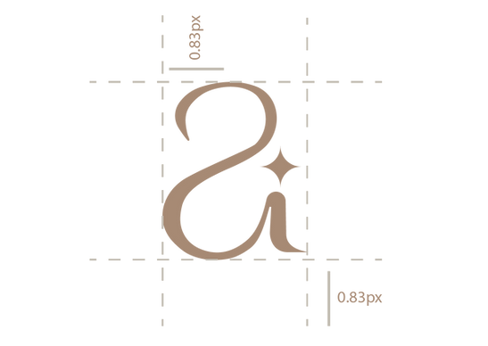
ICON PADDING
Leave adequate breathing space around the icon. Minimum space shown below.
LOGO ON BACKAGROUNDS

LOGO MISUSE

COLOUR PALLATE
#c1bbb0
#a68972
#212121
#010101
TYPOGRAPHY


BRAND APPLICATIONS AND PACKAGING DESIGN


